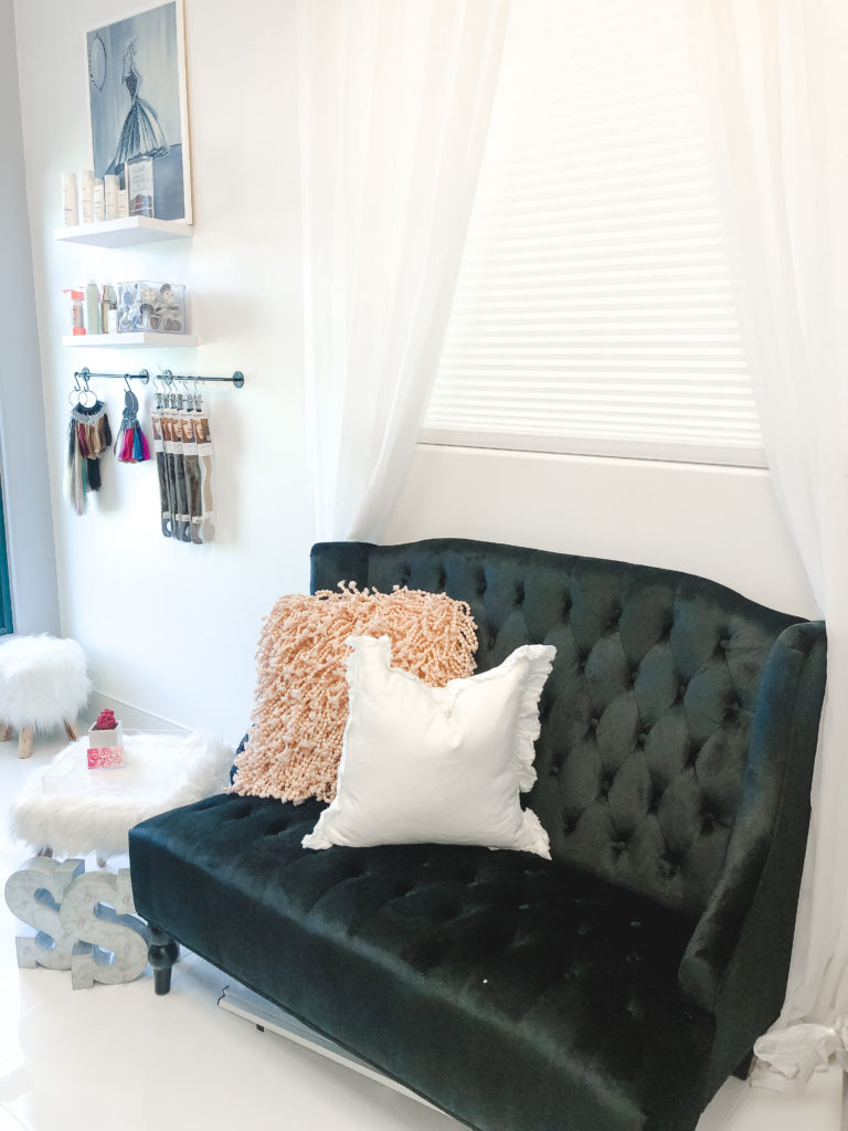
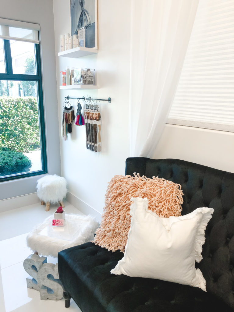
Sammy’s Suite is complete (poet and I know it 🎤). Finished up styling this hair + makeup studio in Wellington. I am overjoyed with how excited my client is with the transformation. We were able to revamp this drab studio to bright white + glam on a minimal budget. I doubled storage as decor to add intentional design. Now, the studio is beautiful + purposeful. Check out the before and after transformation! ✨
Sammy contacted me to help “refresh” her salon in a local salon suite. The salon itself is fairly new, bright, and a great space to work with. We were able to give Sammy just the design she was looking for, without breaking the bank. Here are some BEFORE photos of Sammy’s Suite.
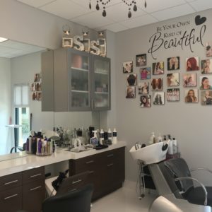
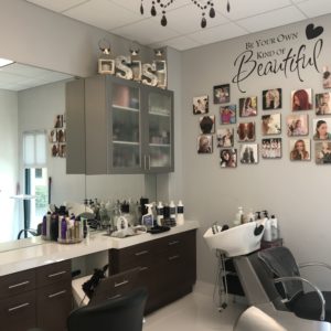
Sammy’s colors and brand started as hot pink, silvers, and glam. In the re-design, there were a few elements she wanted to keep. I used many of the decor pieces to reduce cost and utilize what she had. She also wanted to keep the main wall square photos in the same in a collage format. Sammy and I talked a few ideas and we got started! Of course, renting out space dictates what we are and aren’t allowed to do and we made it work! This project was a blast because we got to see the room transform with subtle and simple updates.
Design by MGH | Sammy’s Suite
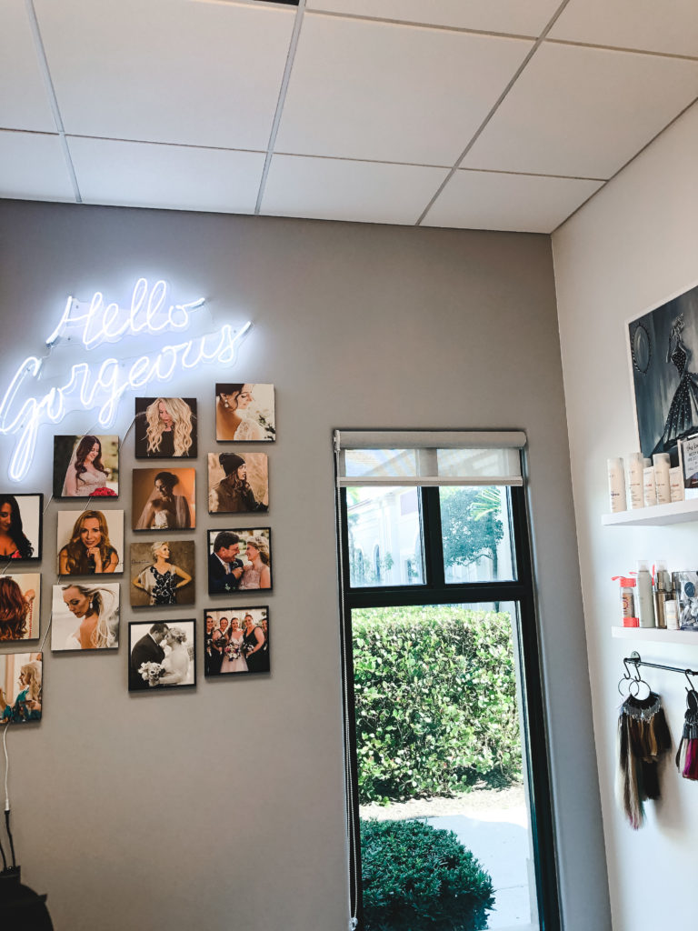
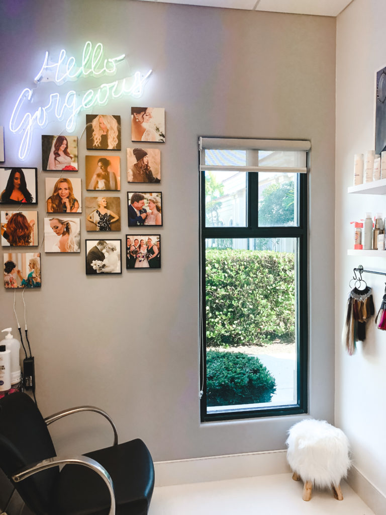
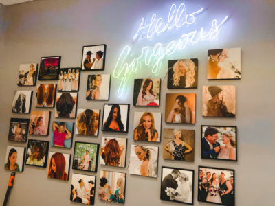
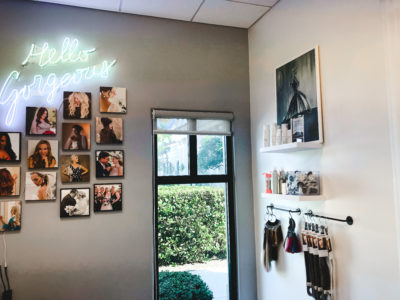
We started by having the entire space painted white with a darker grey accent wall. Here, I chose to add a fun vibe by sourcing this neon sign. The neon was a great way to add a touch of trendy + glam in one piece. Function was a very important aspect in this design project. I added a space that doubled as storage + design on the adjacent wall. I added two floating shelves to to display shampoo + styling items available for purchase and two small rods with hooks to display hair extensions and hair color options in an aesthetically pleasing way. I love this little corner.
The waiting area is the perfect combination of glam + fun. We used the tufted sofa Sammy previously had and added fun throw pillows in white and blush to give it a youthful and new feel. I sourced this fun fur table and acrylic tray to display business cards… and of course, a little cactus. I also added white sheer window panels to let the light in and add texture to the walls.
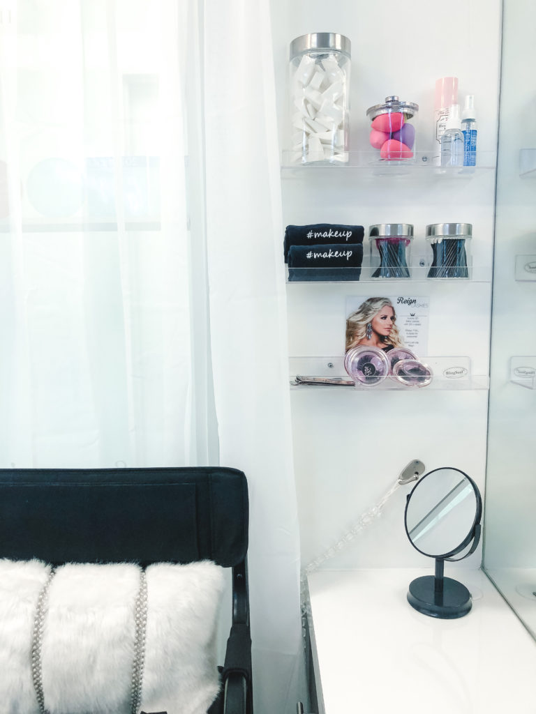
I was able to utilize a small space in the corner for makeup display and storage. I had these acrylic shelves installed as a way to organize, store, and display makeup. When clients come in for makeup, Sammy uses this area + makeup chair. To me, this was the perfect way to utilize space and still keep things looking crisp + clean.
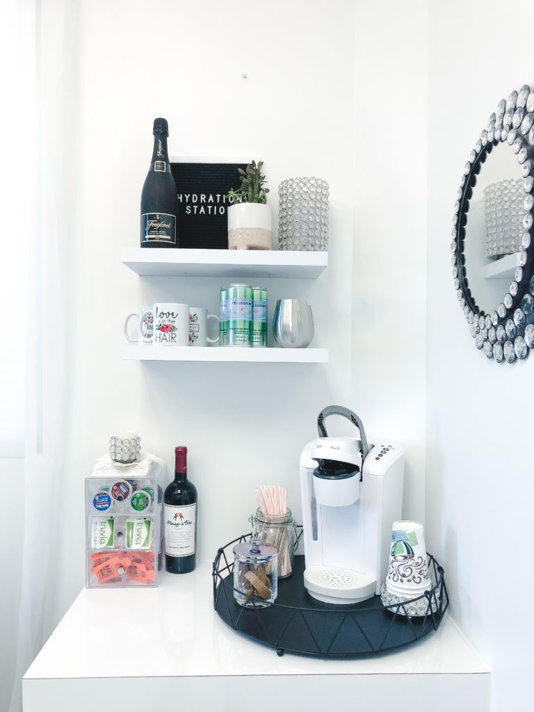
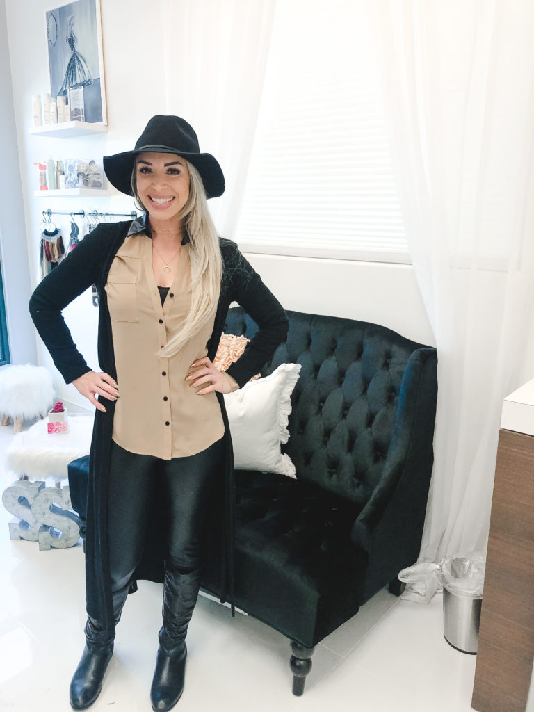
Sammy’s “must have” in this design project was a beverage station. I have to say, this was definitely my favorite part. I used two matching white floating shelves to mock the other side of the room and bring the look together. I sourced a fun tray, coffee maker, organizers, and decor to create an inviting (and thirst-quenching) space.
Speaking of “hello gorgeous!” I love seeing a happy client – Design by MGH | Sammy’s Suite! Thank you for allowing me to help you with this project! I can’t wait to do more together! Happy hair + makeup! Visit Sammy’s Suite here.

Apr 30, 2020
Design by MGH | Sammy’s Suite
The MGH Newsletter
Get FREEBIES, design inspo, real estate market trends, blogs, and shop goodies!
Florida Interior Designer and Realtor
copywright 2024 / megan gribble home
privacy policy / design by mgh + ASDC
@megangribblehome
let's be friends
Sign up to receive design inspo, real estate listings + trends, and lifestyle tips.
